A double page art journal today with a fun theme!
video tutorial
You can enjoy the video below or at my YouTube channel
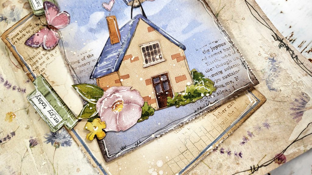
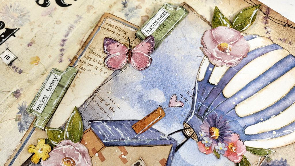
close-up photos
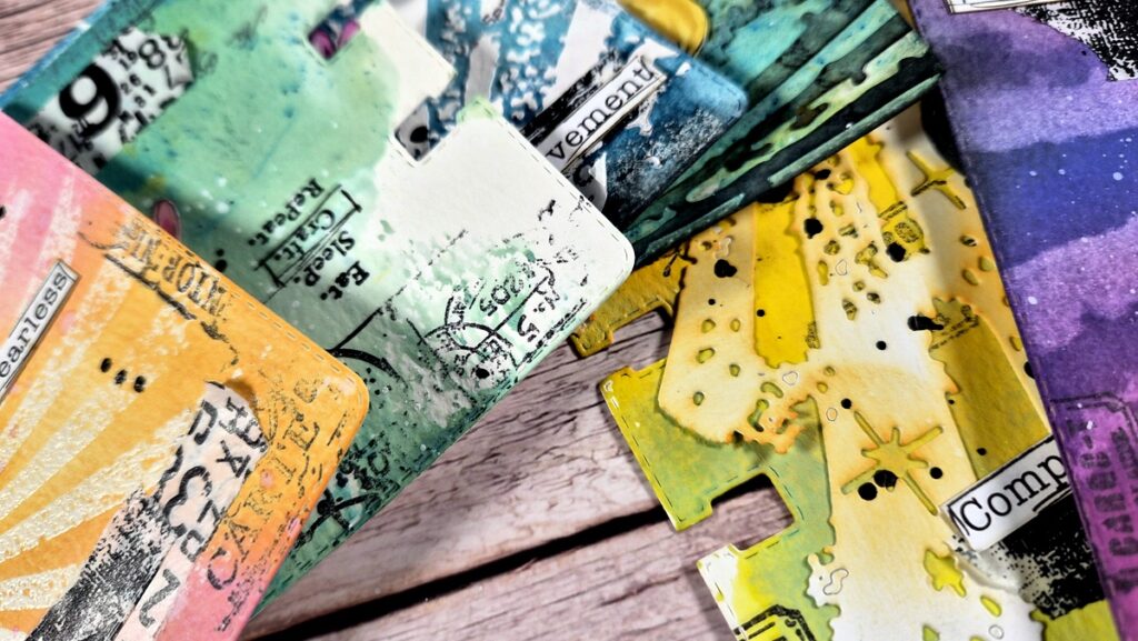
Here are some close-up photos on today’s art journal
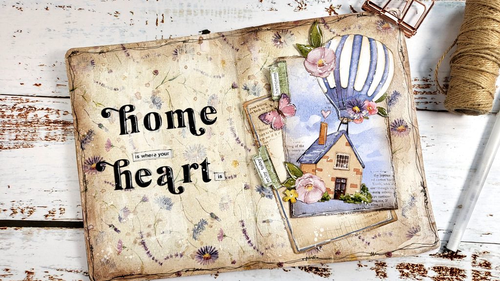
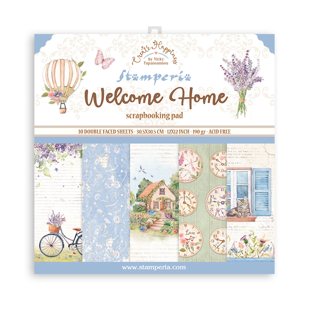
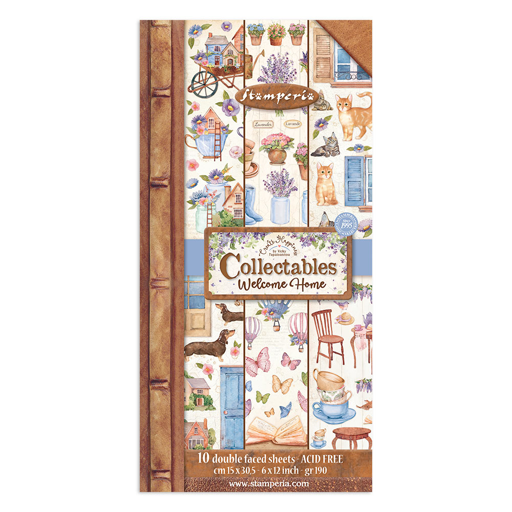
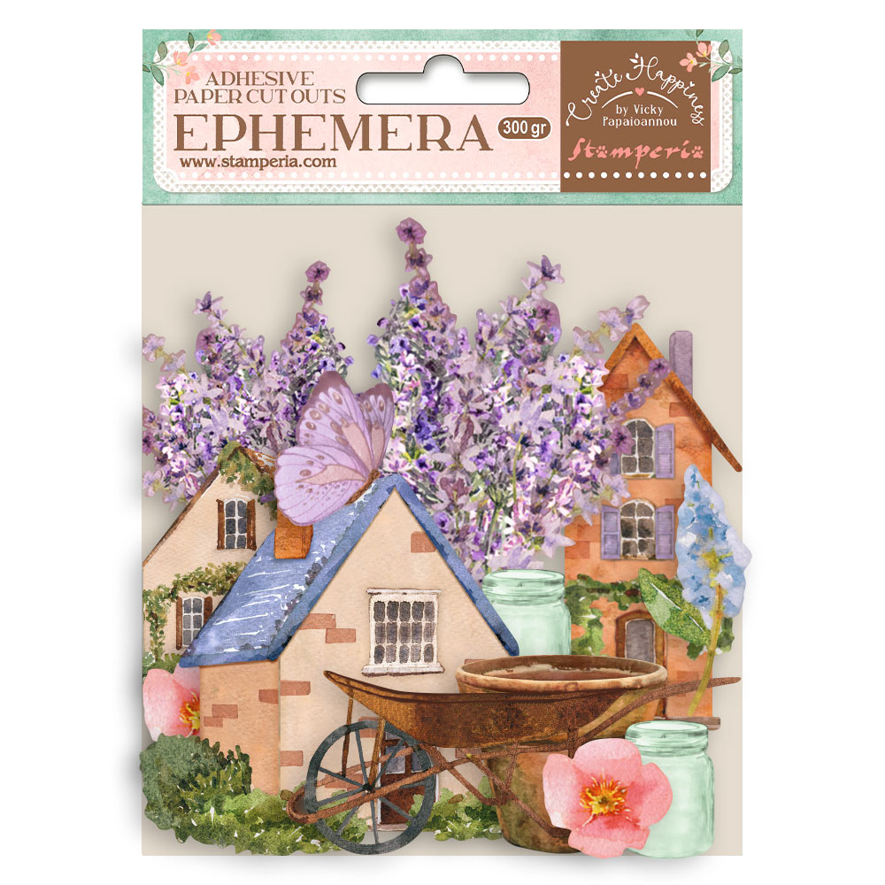
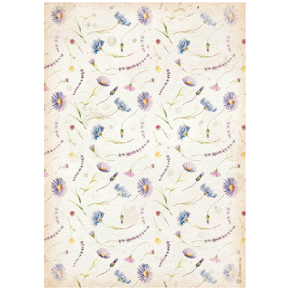
All the papers and ephemeras are from my latest Stamperia collection “Welcome Home”.
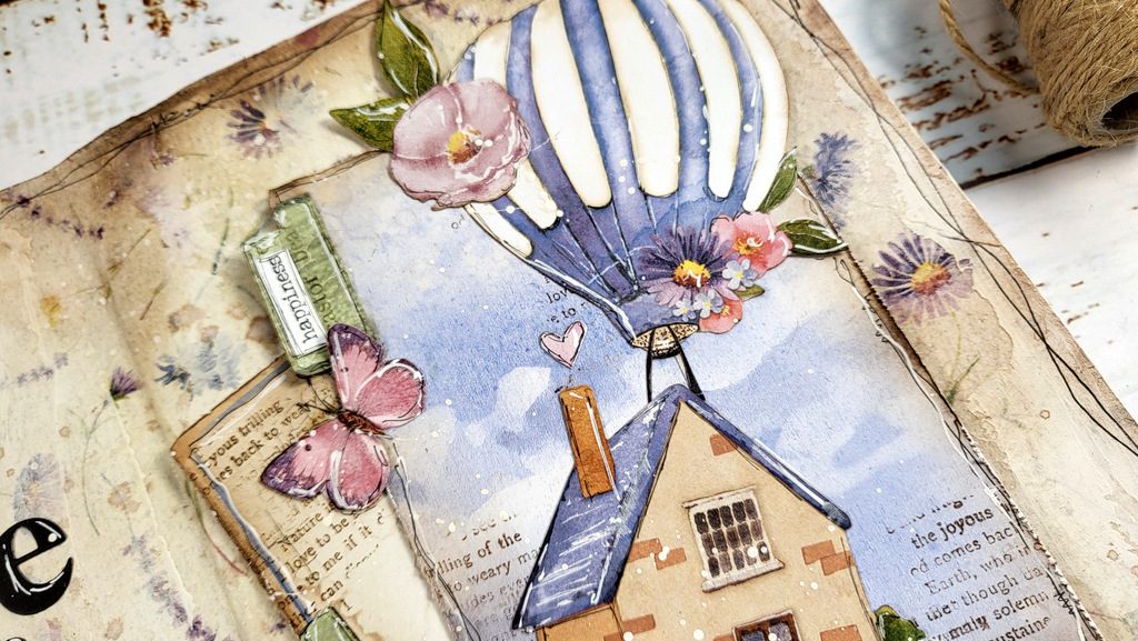
The background was so easy to make just by using one of my rice papers. Instantly get rid of the blank pages!
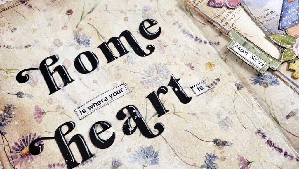
Lot’s of other mixed media techniques were used to bring everything together, inking, splatters, applying paint with spatula… make sure to watch the video!
supplies
Below you can find a list of all the products used today. Links to multiple online shops are available, just click the logo below each item. Affiliate links used where possible at no extra cost to you.
|

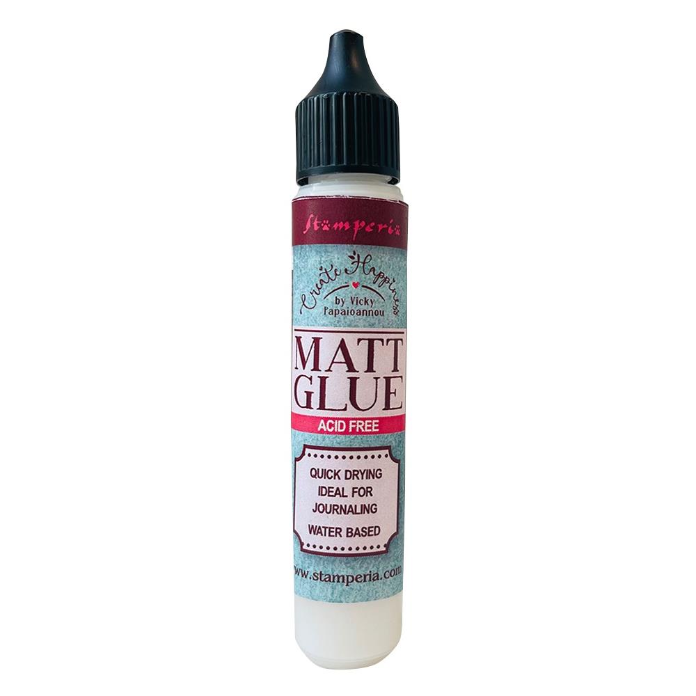

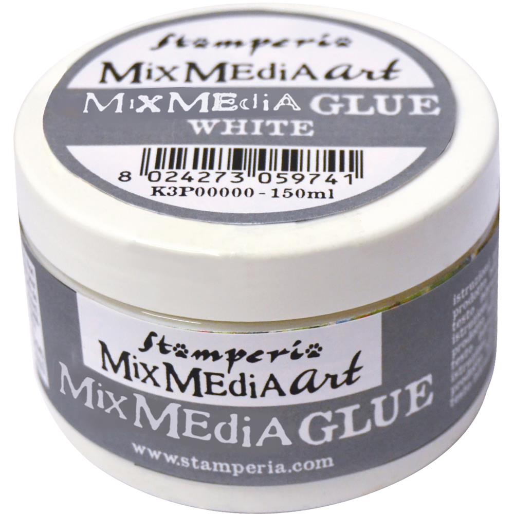






Love love love it!!!
I’ve moved so many times in my life that this page really speaks to me!! I love it! Love all the details — like the heart above the chimney and the labels on the folder labels, etc.! Appreciate you using your rice paper. I love that paper and am looking forward to adding it to my stash. Although I have some rice paper and like using it, I’m not always certain how to use it. It was magical watching the paper go from a bright paper to something more distressed/vintage looking background using only some paint and ink. I also really like the font of the alphabet die set you used. Thanks so much for the video, Vicky!
Thank you so much for the feedback! The truth is that I love rice paper too but always forget to use them!!!
Another gorgeous page! I have a lot of your collection but now it feels like I HAVE to buy more! LOL
I so enjoyed watching this video and I am inspired, thanks Vicky. But I didn’t find among the supply list the sticker (words) you put on the tabs. I’d love it if you could give info on that. Thanks in advance.
Thank you! This is a booklet of stickers by tim holtz that I have for years. Sorry I forgot to link to it, I am adding it to the list now!
Great pages. My supplies are on their way. I get so much enjoyment and knowledge from duplicating your pages. After I try another layout out with different images but same techniques
listen daily!!!!!!!!!!!!!!!!!!!!!!!!!!!!!!!!!!!!!!!!!!!!!!!!!!!!