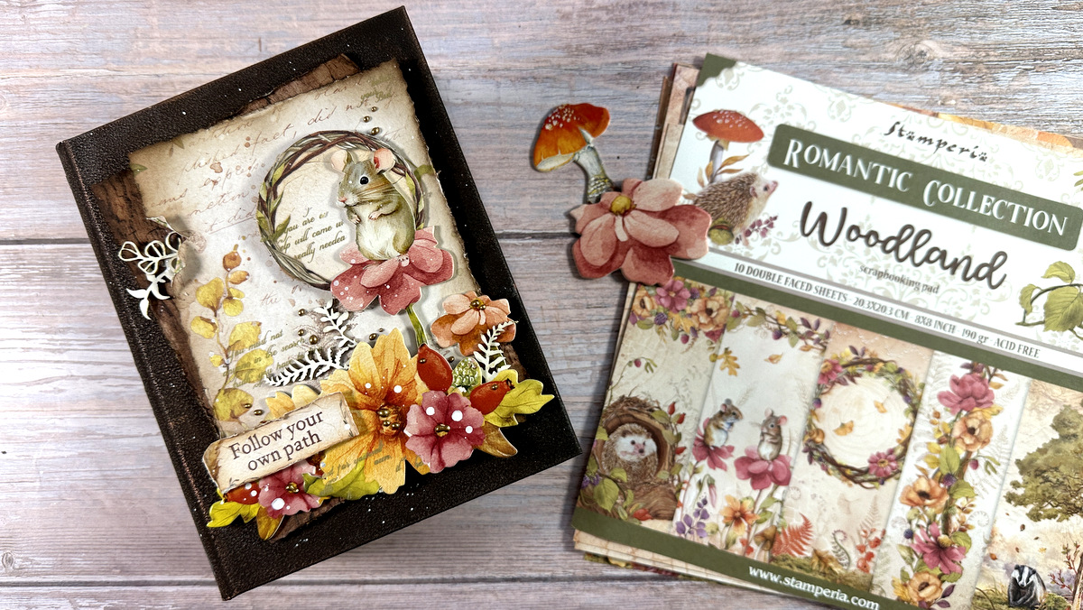
Hi! I am back with a mixed media video today and I am sharing an album cover. I worked on one of my A6 journal organizers, the ones with the elastics that I use to store my mini journals. But you can definetly turn this design into a card!
video tutorial
You can enjoy the video below or at my YouTube channel
close-up photos

here is a close-up where you can see lots of details such as the decorative chimps, the contour liner dots, the die cuts dimension and even the splatters!
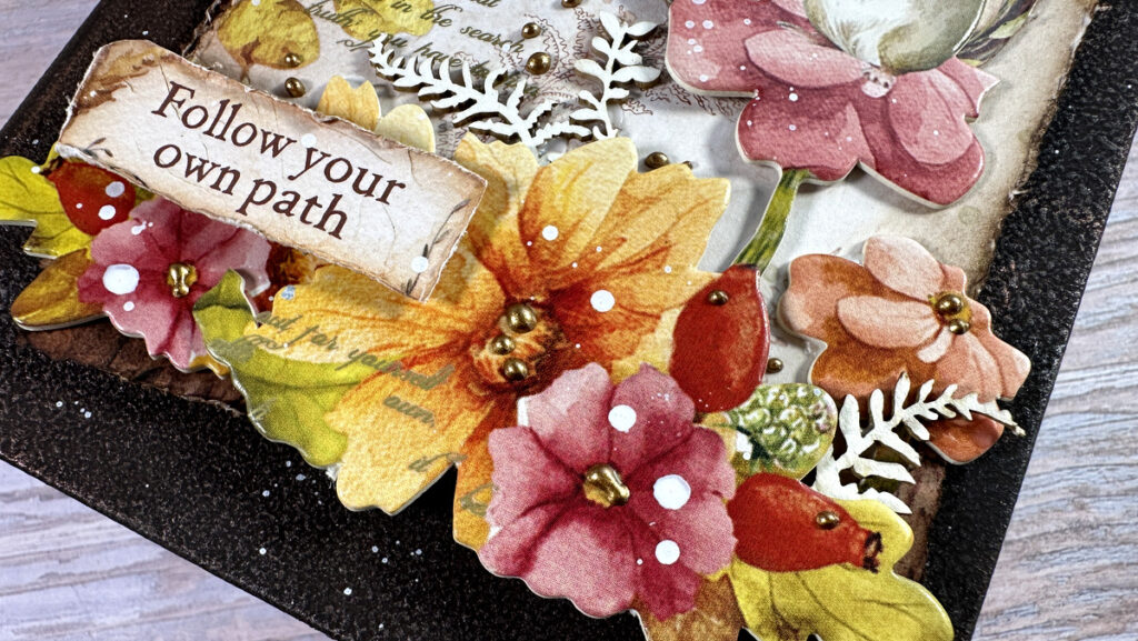
it is an adorable album cover and I love the fall color combo
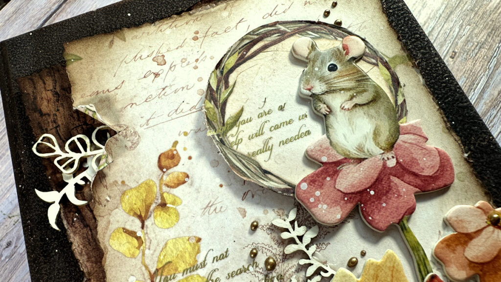
one of my favorite techniques to add texture and dimension on the cover as well as the spine – check the video for step by step
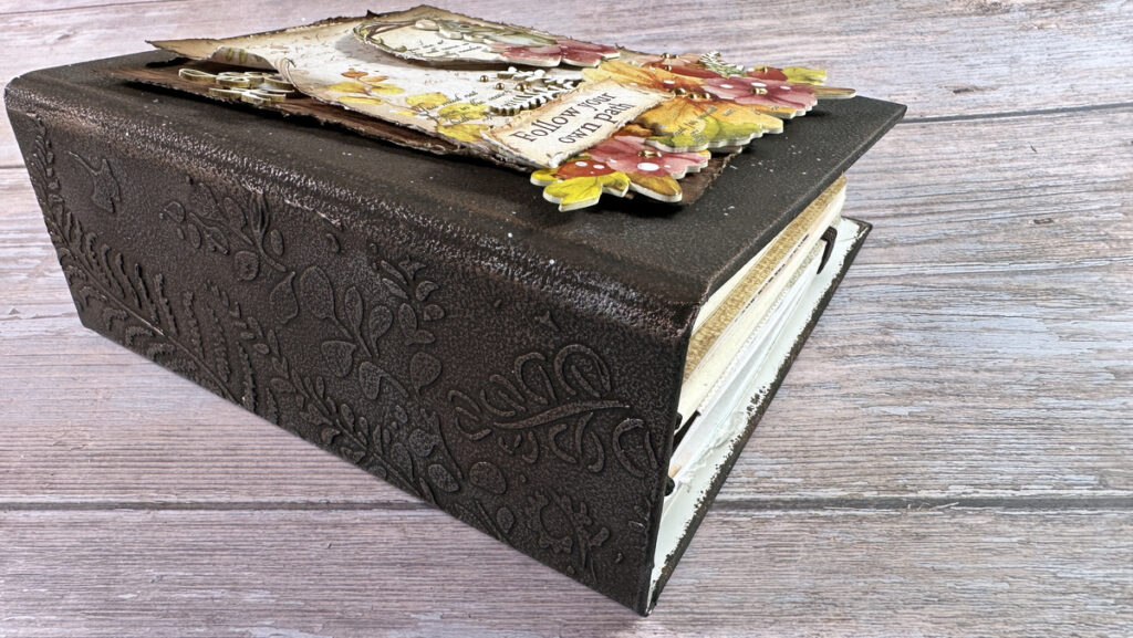
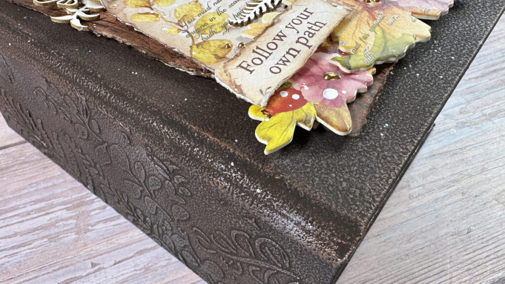
here is a better view on all that texture on the album cover
supplies
Below you can find a list of all the products used today. Links to multiple online shops are available, just click the logo below each item. Affiliate links used where possible at no extra cost to you.
|




Wow! The way you do this really makes it looks like it is leather! I love watching your process and really wish that I had all the products that you use so I could try all of what you do in the video, but my budget doesn’t allow it at this time. Thank you for your very informative video. LOVE this project!
WOW! Love the background! Thank you for sharing how you add the wax. I think your practice of putting the wax on your hand first might help me and I’m going to try it. Seriously, Vicky, your background is stunning!! Thank you for sharing so many techniques — some of which I’ve tried and use! As always, thank you for the video! Happy Fall!!
Hello dear Vicky,
I think your mixed media projects are really beautiful and I’m always impressed by how you combine different elements. Each one is beautiful! Can you tell me what kind of white paste you used on the spine of the book?
Many thanks for your response.
Kind regards, Michelle
I read news!!!!!