This is the first of a number of challenges between me, Kathy and Deborah . That Kathy sure knows how to throw down color – she ought to do it at least once a month with us.
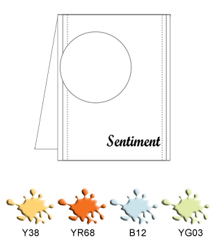
The idea of the “Color Throw down” is to make a card using a number of copics that do not blend!! YES! You can make a gorgeous coloring card without having to pay a fortune on copics, to have all those matching colors.
Here is the sketch and the copic colors we have to use.

Visit Kathy’s blog for more details on the challenge and join the fun! A random winner will get a great price!
Now this is a real challenge for me, since my style is not coloring and I definitely love paper piecing and distressing. So here is what I found out. Try using colors on kraft! Great vintage look when not used on bright white paper.
So here is my card:
and a closer look
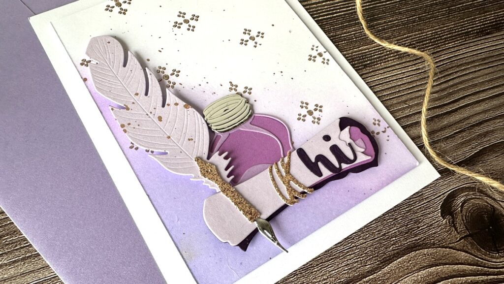
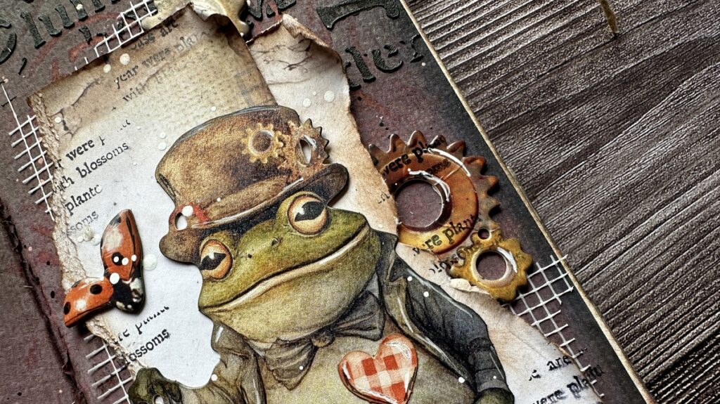
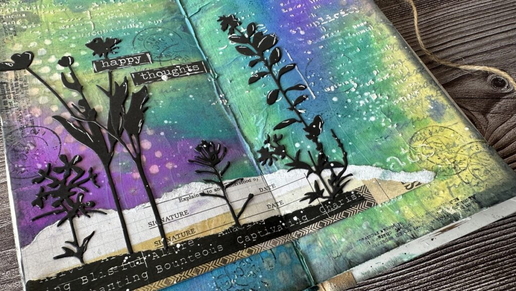
Now here is a sneak peek on the cards of the rest of the team





Love your cars is amazing I make a card inspired by your card hope you like it =P
LOVE it on kraft! And the few white accents add so much! Great idea for a challenge, and can’t wait to go see Kathy’s and Deborah’s!
Great idea to color with Copics on Kraft, Vicky! Hope I find time to play this week! Love your beautiful card!
LOVE LOVE LOVE your take on the color challenge! simply stunning! Can’t wait to hear what’s in store for future challenges!
Love this card so much! Wonderful colors and love your distressing job!
LOVE your card!!! And what stamp co is the darling couple?
Thanks for commenting. The stamp is by Penny Black
Great looks on the Kraft paper, love it. Wonderful challenge, I’m with the family now so probably won’t be back in time to create for this one, but next time for sure! Patti